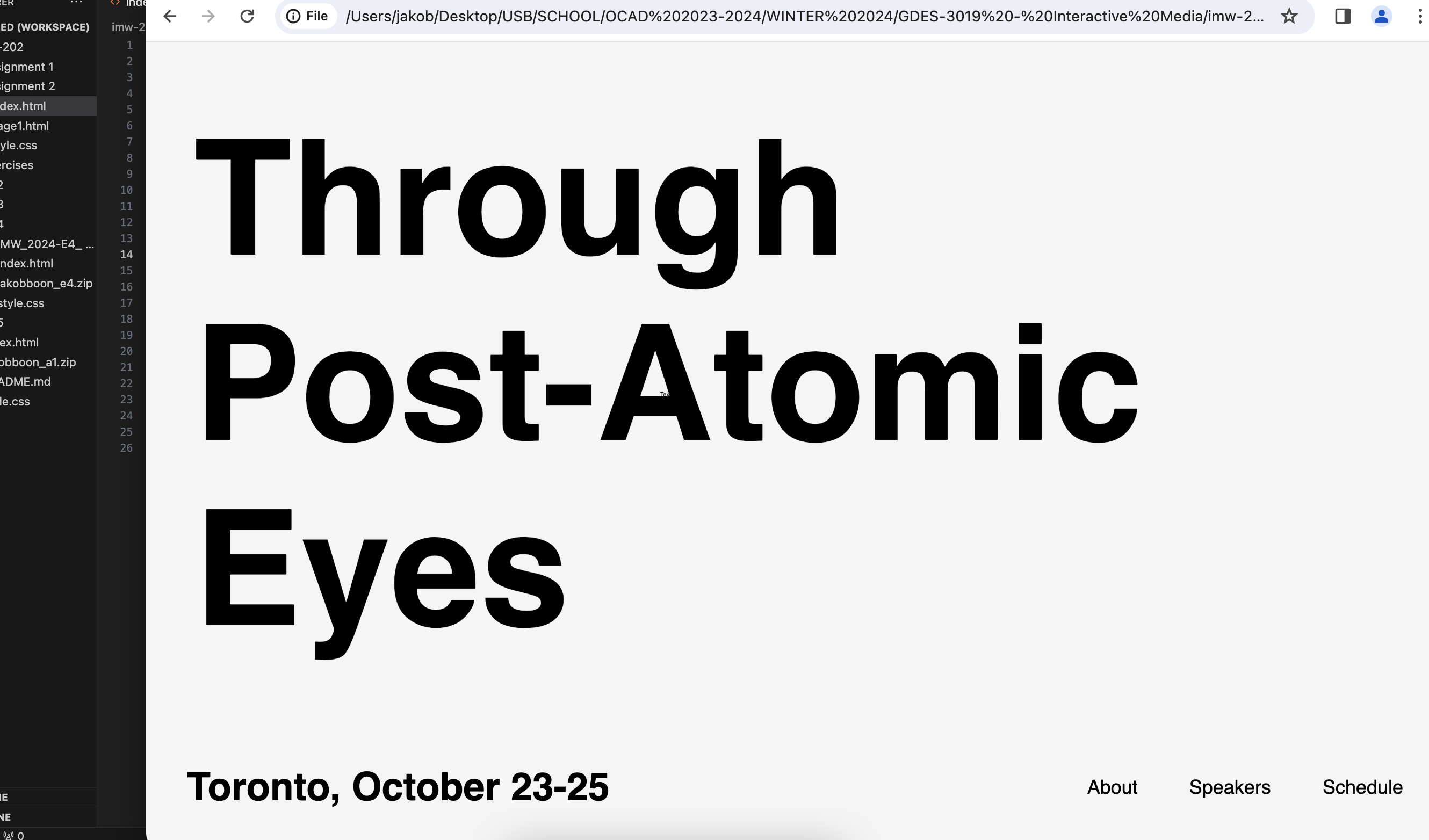
Early Test
After getting the layout down, I started testing visual themes to make subtle nods to the subject matter of the book. This example was mostly showcasing the layout and original idea.

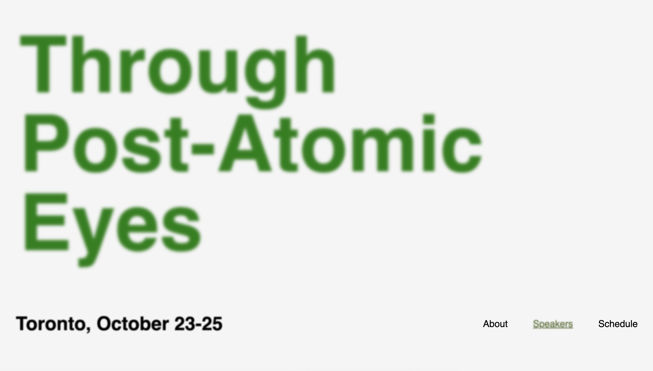
Blur Test
Originally, I wanted to go for a soft glow look - i found this technique make the words hard to read. But this concept became the foundation for the final result of the landing page.

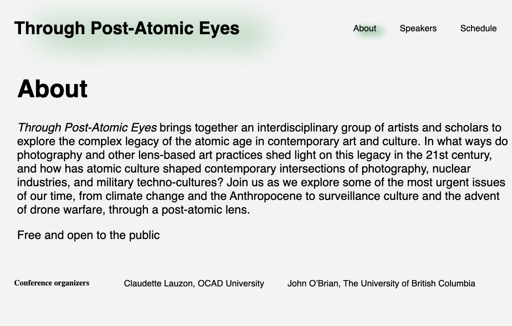
New Page Test
I knew I wanted to spread the content across multiple pages, starting with the about section. This was the first page I did, and the CSS styling I made became the frame for the rest of the additional pages. In this screenshot I was testing out the blur shadow I added to convey which page the viewer was on.

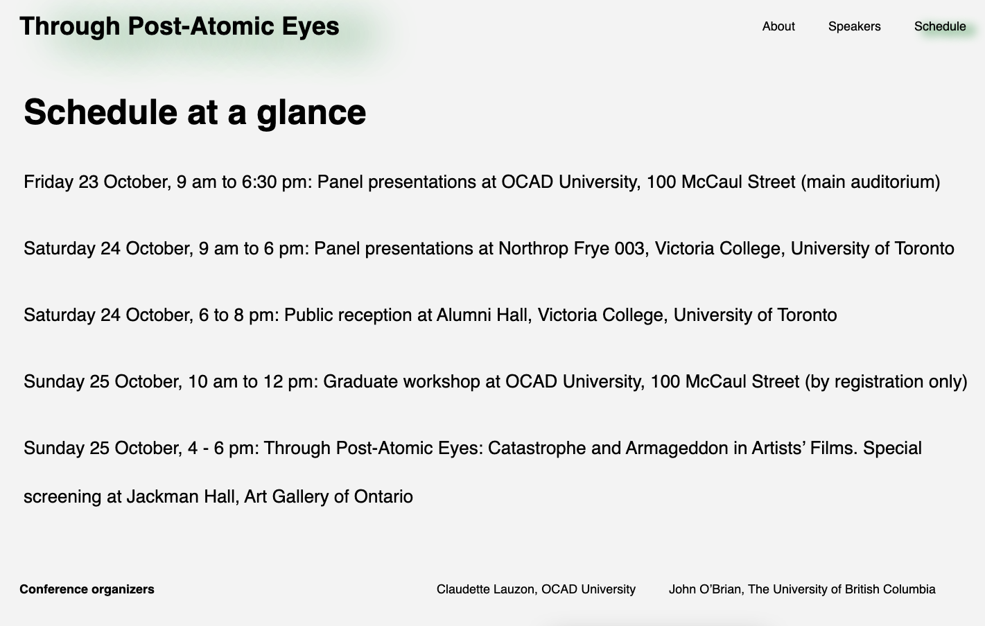
Schedule Page Spacing
I was happy with majority of my site, but couldn't land on a good look for the schedule- this is what it looked like originally, following the layout of the speakers page.
